VMenu
VMenu
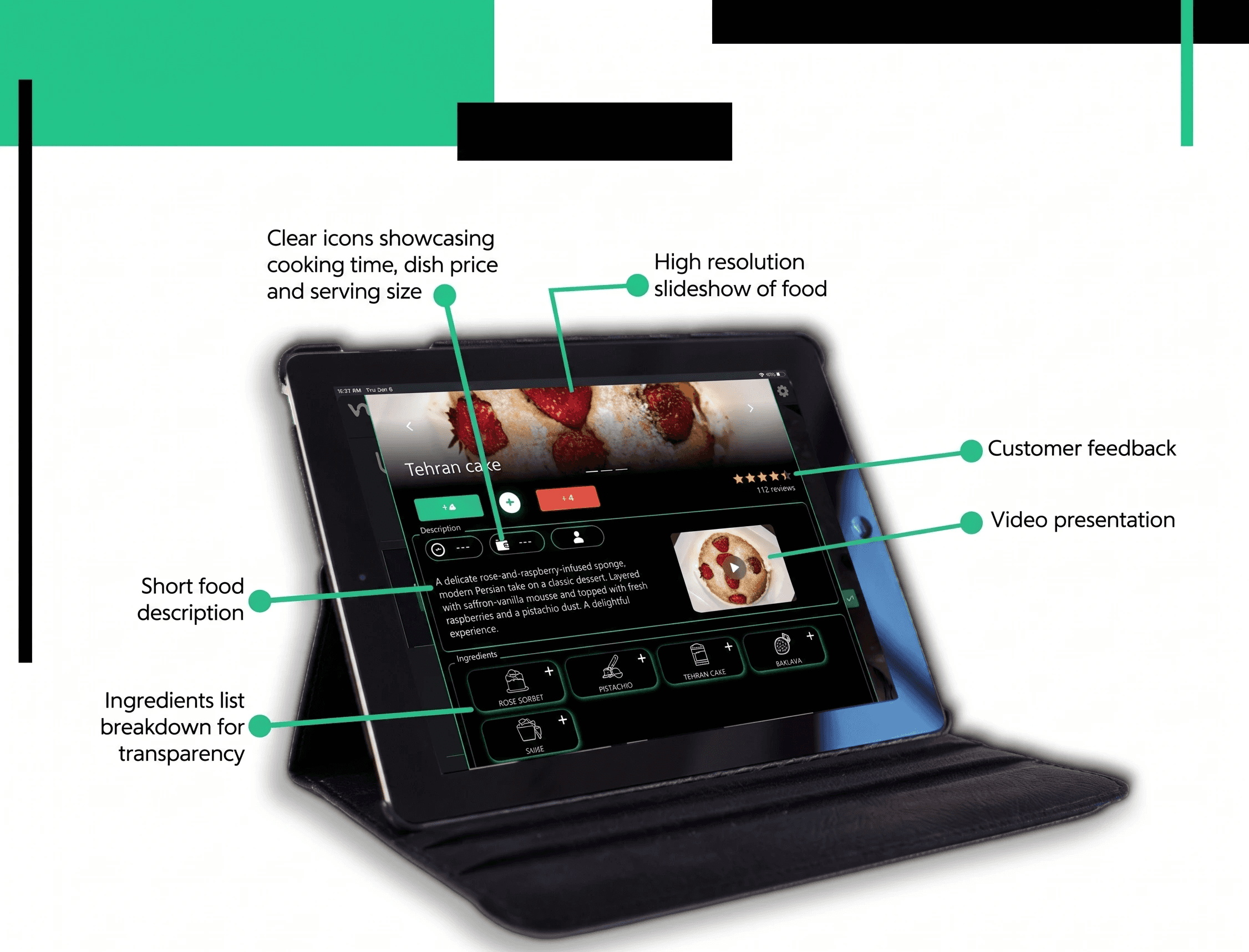
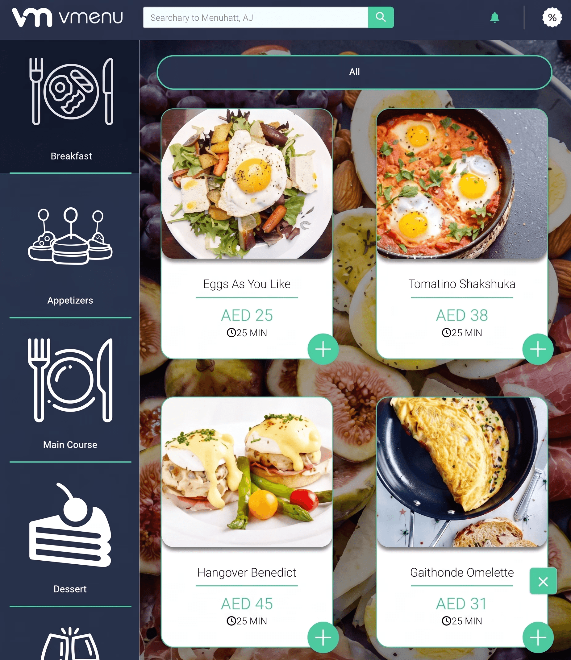
A QR based food ordering product designed to improve customer decision making, strengthen operational clarity, and create a more consistent experience across customer, kitchen, and admin workflows.
A QR based food ordering product designed to improve customer decision making, strengthen operational clarity, and create a more consistent experience across customer, kitchen, and admin workflows.
Region
Region
Dubai
Dubai
Year
Year
2019 - 2020
2019 - 2020