VMeals
VMeals
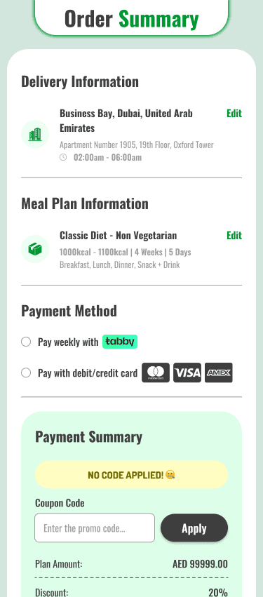
A subscription based healthy meal plan product focused on clearer customer journeys, stronger conversion, and a more scalable experience across both customer and internal workflows.
A subscription based healthy meal plan product focused on clearer customer journeys, stronger conversion, and a more scalable experience across both customer and internal workflows.
Region
Region
Dubai
Dubai
Year
Year
2020 - Now
2020 - Now